


[Book Club] The Non-Designer’s Design Book

The Non-Designer’s Design Book
Robin Williams
Three-Sentence Summary
Design is everywhere, but not good designs. This is a book mainly about graphic design. Introduction level instead of a textbook.
Who Is This Book For?
Anyone who wants to level up their design eyes for presentations, websites, business cards, résumés, posters, flyers, brochures, books, etc.
Major Concepts
The following sections are mostly directly quoted from the book. I don’t want to recreate the meaning as the author writes them well.
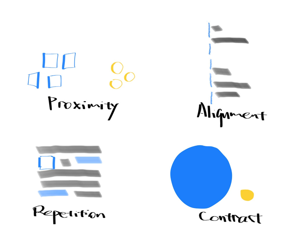
Four Rules for Design
Proximity. Elements that are intellectually connected and have some communication relationship should also be visually connected. Unless you are drawing a table, don’t let elements be equal distances from each other.
Alignment. Nothing should be placed on the page arbitrarily. Every item should have a visual connection with something else on the page. If text is aligned on the left or the right, the invisible line that connects the text is much stronger than centered alignment because it has a hard vertical edge to follow. The strength of this edge is what gives strength to the layout.
Repetition. Repeat visual elements of the design throughout the piece. The repetitive element may be a bold font, a thick rule, a particular bullet, a design element, color, format, spatial relationships, etc.
Contrast. If the elements (type, color, size, line thickness, shape, space, etc.) are not the same, then make them very different.
Three Components for Graphic Design
There are three attributes in general graphic design—color, typography, and typeface. All of them can be used to create proximity, alignment, repetition, or contrast. And, of course, they have their own rules to follow.
Color is too complicated of a topic; I will not summarize it. One thing worth meaning is the color system. CMYK is used in print; RGB is used in electronic devices.
Typography is loosely related to grammar. It is stunning that so many people with a university degree cannot write correctly. We now have tools like Grammarly to help us check English spelling, tone, and punctuation. Please use them to be mindful of what you put on the screen. Here are some other aspects we need to be aware of.
Quotation marks: In the US, commas and periods are inside quotation marks; colons and semicolons are outside; question marks and exclamation points depend on the relationship.
Apostrophes: An apostrophe means a missing letter except for possessive words (dog’s bone).
Do not use the underline.
Avoid Widows and Orphans: Don’t leave less than 7 letters in the last line or on a separate page.
A paragraph indent is roughly two Spacebar spaces.
Indentation or extra space between paragraphs: choose only one.
Typefaces are one of the most ignored factors in unprofessional design. It is easy to change, and the changes are usually too subtle to stand out. The author only talked about English (or Latin languages). There are six categories of types: style, Modern, Slab serif, Sans-serif, Script, and Decorative. Knowing exactly which you use is less important than consistent design and purposefully creating contrast.
Using both Helvetica and Roboto in a single document is not a good idea, as they are all from the Sans-serif family, and the difference is too small to create contrast. Still, it is big enough to cause discomfort.
Also, you should be mindful about using Decorative fonts. Unless it is meant to create a festival feeling and cheerful, using it only makes the document immature.
Want your friends to know about this newsletter? Share them!